Stats and profile dashboard focused on reducing time spent navigating complex systems.
DashboardsInformation ArchitecturePERSONAL
Anthony Jasper30+ DaysDesignerFigma
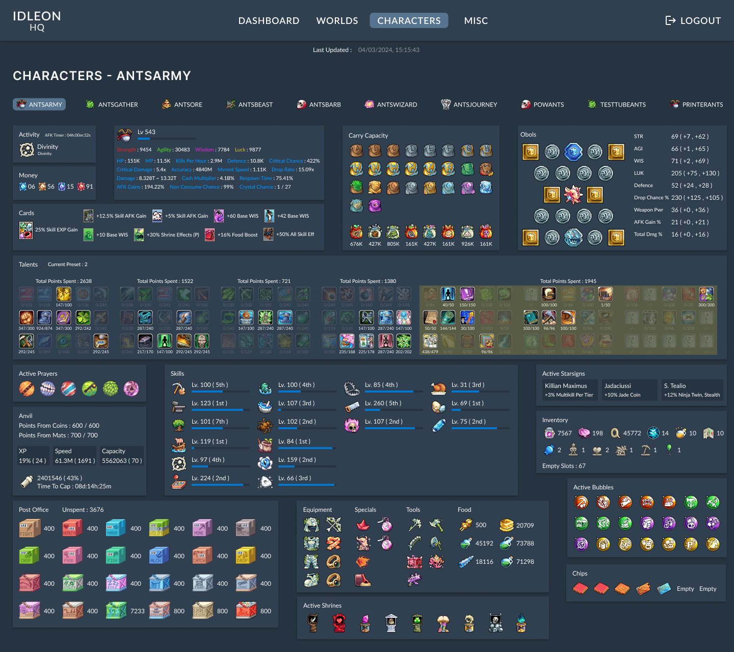
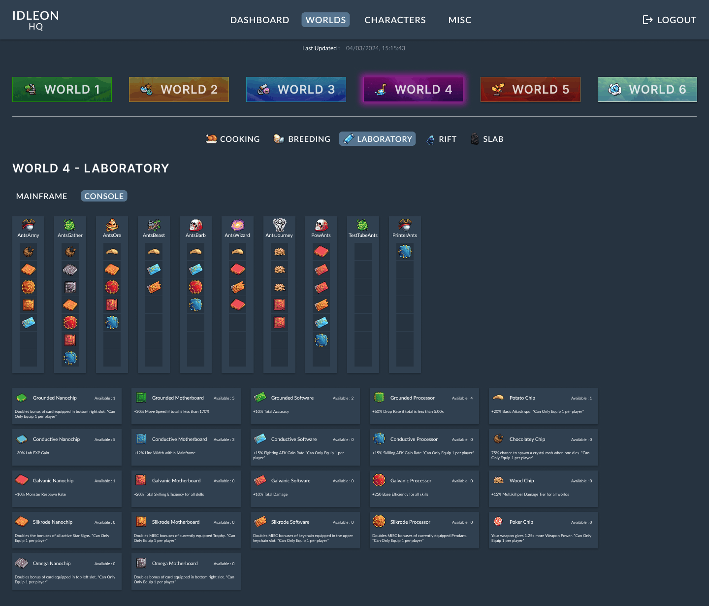
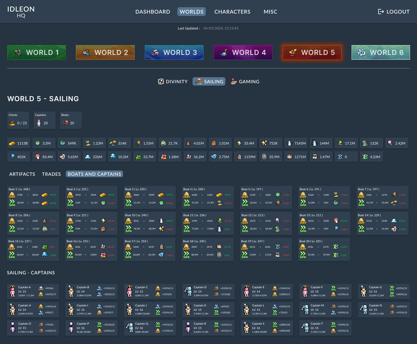
IdleonHQ is a companion dashboard designed to centralise a player’s profile and statistics into a single, accessible interface.
The game features over 50 interconnected skills spread across multiple systems, making it time-consuming to navigate and understand overall progress. IdleonHQ reduces this complexity by bringing all key data into one place, allowing players to compare stats, plan progression, and make informed decisions without unnecessary friction.
Idleon presents players with a large volume of interconnected data spread across multiple in-game systems.
Idleon has over 50 skills that all feed into your progress, but there's no single place that shows how you're actually doing. You end up jumping between screens and comparing numbers yourself just to figure out what needs attention next.
Idleon already throws a lot of colour at you — different colours for classes, skills, systems, all of it. So I kept the interface itself neutral. If the background started competing with all that with its own strong colours, it'd just add to the mess instead of staying out of the way.
A dark blue palette was selected for the base interface, using #263340 for the background and #304050 for component containers. This pairing provides clear contrast between layout layers while remaining easy on the eye during extended use. Importantly, these tones sit outside the game’s class and skill colour system, ensuring in-game colours remain readable, meaningful, and unambiguous.
Given the density of information presented throughout IdleonHQ, typography needed to prioritise clarity and sustained readability.
Lato was chosen for its neutral tone, consistent letterforms, and strong legibility at smaller sizes. Its clean structure supports long-form content and dense data layouts without drawing attention away from the information itself.
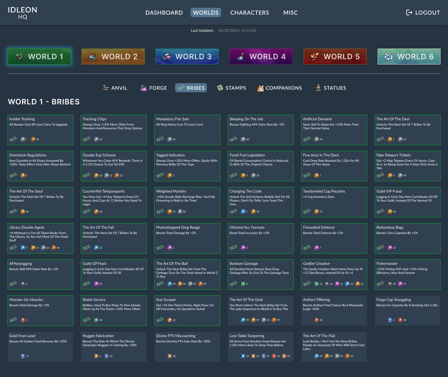
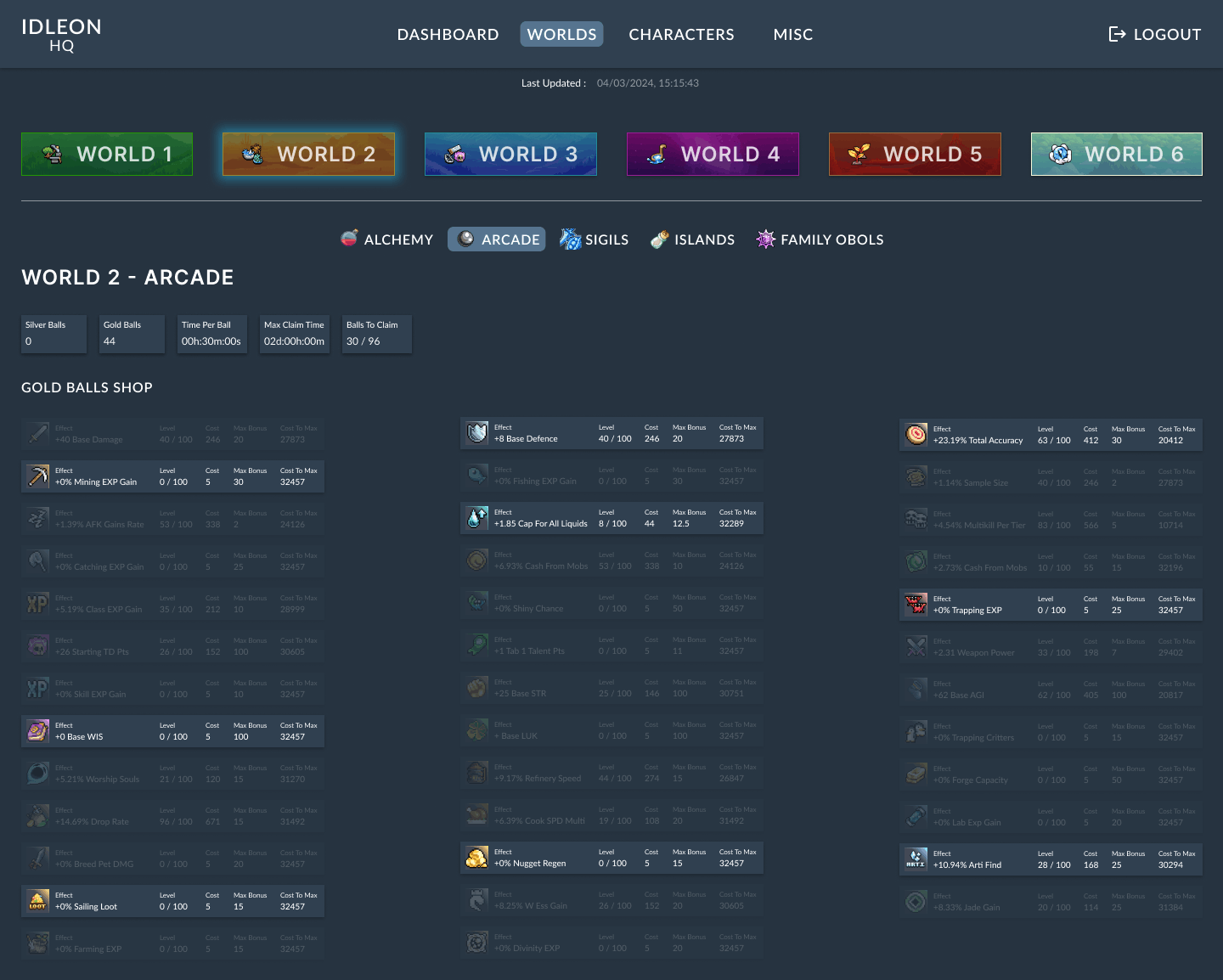
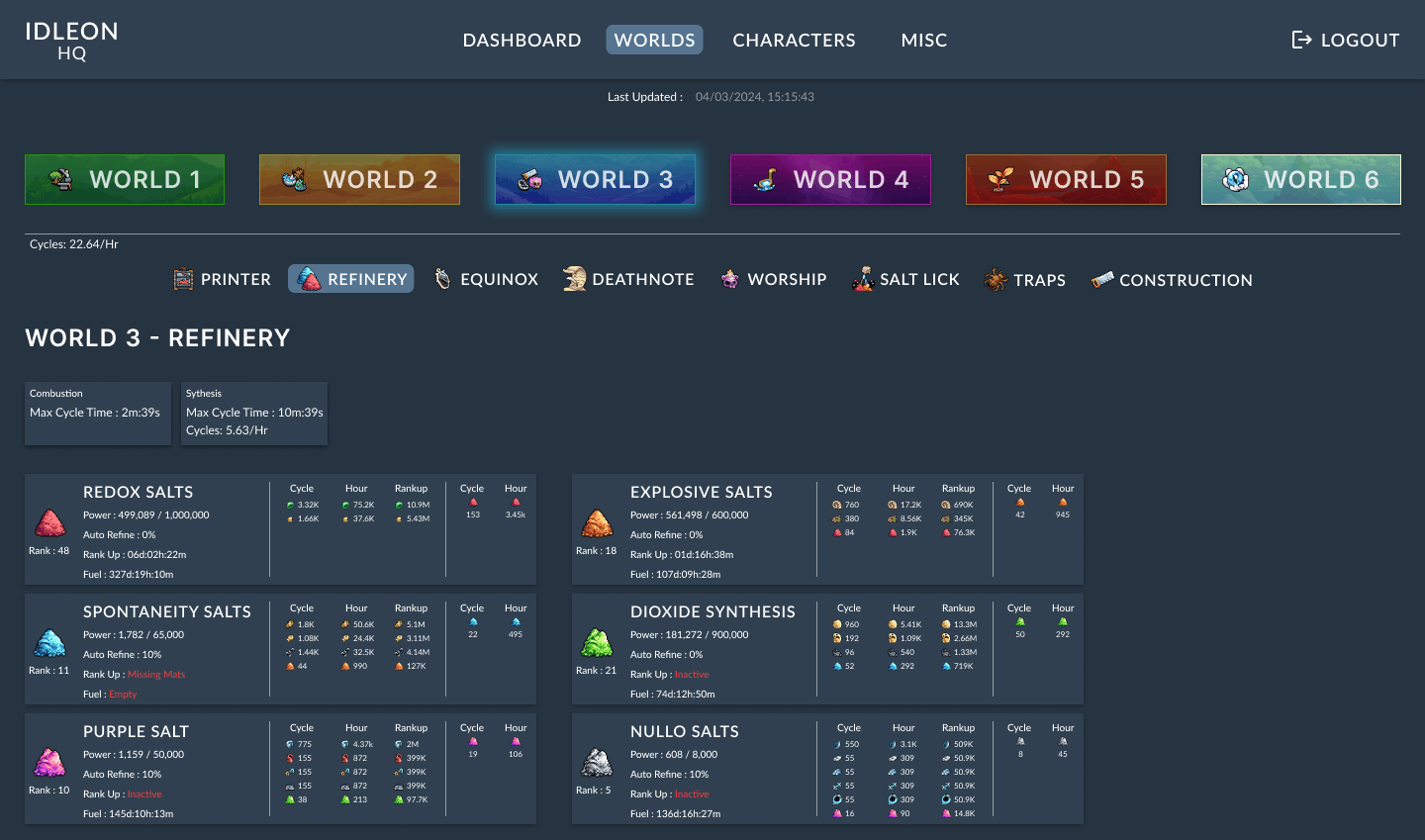
Card-based components form the foundation of the IdleonHQ interface. Skills vary in size, structure, and the data they present, but each card maintains consistent shape, colour treatment, and shadow styling. This consistency allows users to immediately recognise interactive elements and compare information across different sections with minimal cognitive effort.
Additional design patterns were selected to support clarity, progression tracking, and efficient navigation:
Navigation tabs to separate systems without overwhelming the user
Levels and progression indicators to communicate growth at a glance
Self-monitoring patterns to help players evaluate current status and plan improvements
Dashboard layout to surface key information quickly and reduce navigation time
Choose Your Path
The Good
App DesignInteractive DesignPERSONAL
Party Planning App
Event planning app designed within predefined visual and typographic constraints.